One thing I have noticed about music magazines is the small header in the corner of the page which is something I definately wanted to add in my own.
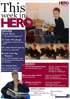
Unlike some magazines I didn't want to make my title too obvious by calling it 'the contents' this would aslo mean repeating what has been named in the page header. So, instead, I decided to say "This week in Hero" by using the house font and the magazines logo. I like the way that the words are wrapped into one column, yet left the title a little larger in order to create emphasis.
I then added the first, main image for the page. I wanted it to make up most of the top right of the page because this is what I have normally seen from other examples of magazines. Not just that but also due to its centralization as an article within the magazine, therefore its importance on the contents page. I like the way that the magazine title overlaps the image as it gives it some depth.
After arranging the second image in various places around the contents page I realised where better to put it than on top of the first. The fading effects and size of the image work perfectly over the top of the larger image, and brings something more to it rather than feet and a drum pedal!
The features section is probably the most important on the contents page so I placed it towards the top, as the eye reads from top to bottom. I have also intendend to make it a little larger than the other sections on the contents page to help it stand out a little more. The titles have been placed in a san-serif font and the description in serif. This has been common in other magazines probably because the serif font seems a little more like someone is talking to you about it, just like words in quotations are placed in the same serif font. This will be the same theme amongst the other sections of the magazine.
This is the second section that I have added onto the contents page. For the size and amount of the writing this was the best position to place the section. The style is of course very similar to the features section but a little smaller in font size.
As you can see I have now included all of the sections requested by my Target Audience questionnaire. I didn't want to make this section too big as it will not be an essential part of the magazine. I also wanted to have room to fit in my final image so this section has been placed perfectly on the bottom right hand side.
I have edited this photo in order to 'cut' around the subject, therefore making the rest transparent. This ends up working well with the placement of the image on the contents page, as the text is able to wrap around the image intead of it looking too square against each other and no flow to look of it.
After seeing the contents as a whole on the previous page I realised that other than the images there was nothing that stood out about it, especially the writing which is meant to entice the audience to read on. This meant I had to bring it together and by using my house colours as the backgrounds to the sections, not only did this add colour and life, but the contrasting colours defined each section instead of it being one big clump of writing. I decided not to use a colour for the 'Who's New?' section as it may be seen as too much. Finally,I added the page number in my serif font and a little website address in the bottom right hand corner of the page, which of course is essential to all magazines.


No comments:
Post a Comment