Here are the ideas that I have played around with and tested just by randomly picking fonts
This last font I was inspried by NME magazine
After some audience feedback within the members of my class it was decided the last font would look the best. I now had to play around with different colours.
Now that I had decided on my font and logo it was time to start producing the magazine
I want to include as much detail as possible on my front cover so I will personalise my own bar code. I used Google to find a good quality picture of a bar code and then fireworks to edit it
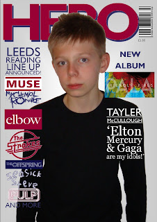
This is my first coverline for the page I wanted to make it strip down the left side of the front cover. At first, I liked the monochromatic tones of the bands logo, which I traced off the internet. However with a few tweaks and more band names I deemed the following more appropriate for my colour scheme.
This is my second coverline, which I wanted to make a little smaller than the first. As this is an article depicting a new album release I wanted to associate an image with the coverline. I have noticed on some music magazines, little articles have been placed in circles as 'stickers' so I wanted to experiment with this aswell. I cut a little part of the album cover and placed it in the circle. I then used a serif font to describe the coverline.
After playing around a bit with the size and style I felt that this design was more appropriate for my own magazine.
In my third coverline again I wanted it to doffer from the rest yet for it all to tie in together. I particulary like the contrasting san-serif and serif fonts which help define the title to the quote. The text was been wrapped carefully to make one straight line.
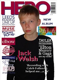
This is the mid-shot image I decided to use on my front cover, I am pleased that it is a simple shot and nothing too 'busy' to look at. I wanted to use my own background for the front cover and thought a simple grey would fill the page out a little. I also at this point I decided I should lose the bluey/purple box behind the third coverline simply because there was too much of that same colour. I also thought the white text contrasted well on the black t-shirt of the model.
In order to help the main coverline stand out, I wanted it to be similar to the masthead. I used similar colours and a white version of the title placed behind it to give it a '3D' effect. I then used WordArt to create another serif quotation to link with the article. The magazine is now looking like it fits together. I did decide to drop the background because I wanted to make the image seem more minimalistic and less tacky.
On the previous stage I was very happy with how my magazine turned out, however, I just had one feeling that there was something missing. So I decided to add a kicker at the bottom.
STAGE 8: Gramatical Tweaks 

After scrutinising my cover I decided to change the name of the artist and edit my kicker to the artists that fit my contents page. I also changed my grammar on my third coverline for the correct quotation marks


No comments:
Post a Comment