Music Magazine Cover Planning
The reason I like this style of front cover is due to the layering effect that the main image will have. With the main member of the band in front of the masthead and the band members' head just sitting on top of their shoulders. I think this will create a sense of depth and professionality. The main coverline is then associated with the main image so therefore is placed at the top right next to the image. The other coverlines are then presented further down.
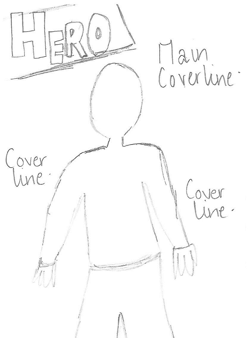
This front cover is very simple and most likely quite boring. And from my research I have found it shows no originality and is only the basic outline of a magazine. The one thing that is important however is to keep the main coverline towards the top of the cover so the audience will see that first. I have only played around with the magazine title in this cover
I like this cover because it plays with the idea of quite a large close up of the subject. A large masthead, coverline and picture will help the magazine 'pop'. However I think this might be too simple and too 'in-your-face'
What I really like about this draft magazine cover are the mixed elements I have involved in the production. The overlapping main image, the large coverline, and the style of masthead. This is very similar to one of the magazine covers that I have analysed, which is where I form my inspriation from

 I have converted my very rough drawn plans to a more accurate plan using Publisher, with the help of ClipArt I was able to immitate the images that might be taken for the real cover


No comments:
Post a Comment